Service Desk reports
Reports in the Support rail is the analytics side of the desk. Five tabs — Overview, Tickets, SLA, Satisfaction and Companies — each answering a different question, all over a date range you set at the top: Week, Month, Quarter, Year, or a custom span, with arrows to step back and forward through periods.
Overview
Section titled “Overview”The shape of the desk right now: how much is open, what’s coming in against what’s going out, and where the backlog sits. Start here when someone asks how the week went.
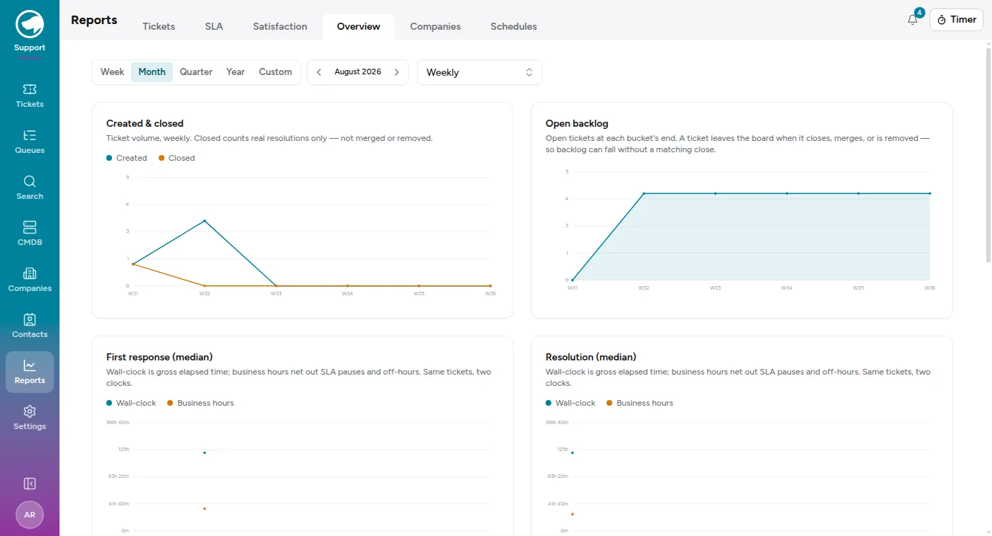
Each chart has a table underneath it with the same numbers, which matters more than it sounds — it’s what you copy into a status email, and it’s readable when a chart with two data points isn’t.
Worth knowing as you read it:
- Closed counts real resolutions only. A ticket that was merged into another or removed doesn’t count as closed. Backlog can therefore fall without a matching close, which is why the two charts don’t reconcile line for line.
- Two clocks, same tickets. First response and resolution are each shown as wall-clock and business hours. Wall-clock is gross elapsed time; business hours nets out SLA pauses and the hours you’re shut. A ticket raised at 5pm Friday looks terrible on one and fine on the other, and neither is lying.
- Median, not mean. One catastrophic ticket won’t drag the number.
Tickets
Section titled “Tickets”Volume, broken down. By queue, by type, by priority, by service, by agent — the counts you need to see whether “we’re busy” is one queue or all of them.
The service breakdown is the one people forget to look at. It’s the answer to “what do we get most tickets about”, which is a question about your product rather than your desk.
Attainment: how often first response and solution deadlines were met, and how badly the misses missed.
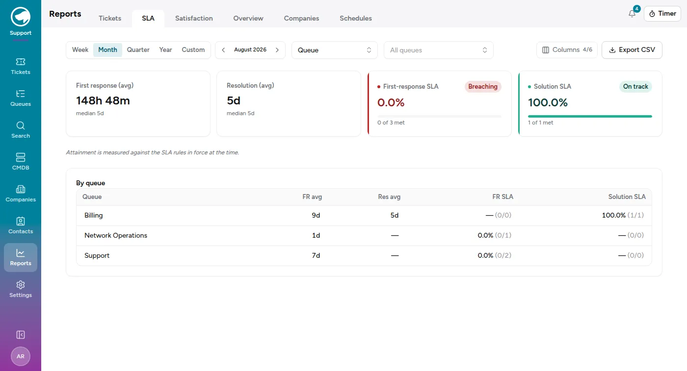
Two things worth remembering when you read it:
- Closed tickets are measured against the SLA rules that were in force when they were worked, not today’s. Tightening a target doesn’t retroactively make last quarter look worse.
- Attainment is counted in business hours where the SLA has a calendar, so an overnight ticket isn’t a breach if you weren’t open. See SLAs and business hours.
First response is grouped by when the ticket arrived; solution by when it was resolved. That’s why a bad week for one can sit next to a good week for the other — they’re counting different cohorts.
Satisfaction
Section titled “Satisfaction”What customers said when asked.
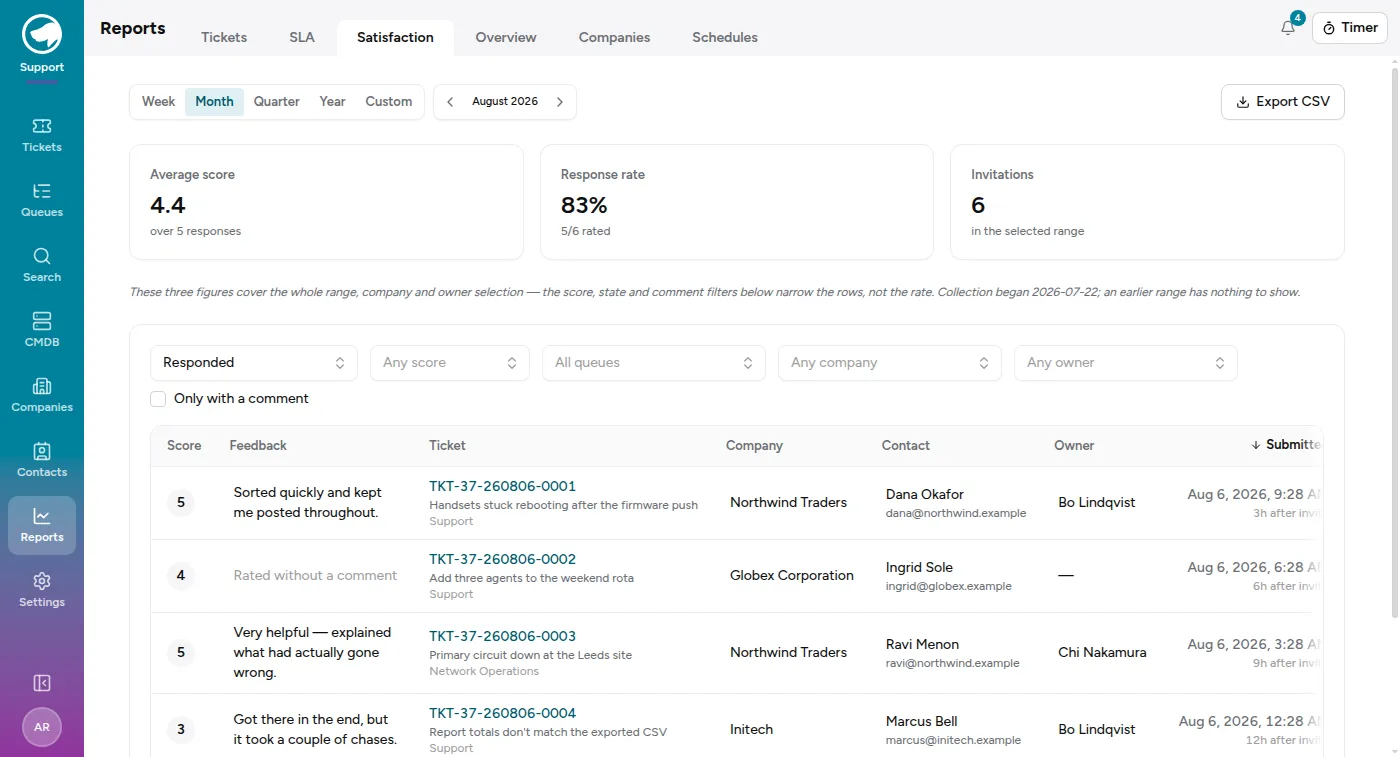
Three figures across the top — average score, response rate, and invitations sent — then every individual response underneath, with its comment, ticket, company, contact and assignee. Filter by score, by queue, by company, by assignee, or narrow to only ratings with a comment, which is usually where the useful part is.
If a whole queue’s ratings are missing, check whether the survey is switched off for it — that’s a per-queue setting and it cascades to sub-queues. See Queues and who can see them.
Companies
Section titled “Companies”One row per customer, and the widest table here: created, closed, open backlog, first-response and resolution medians (both clocks), first-response and solution SLA attainment, reopens, and that company’s CSAT. It’s the account-review tab — and the one to open when you suspect a single customer accounts for most of a queue’s load.
The CSAT columns behave differently here than on the Satisfaction tab, and it catches people out: the average needs five responses from that company before it shows a number. Your desk-wide average can read 4.4 while every company reads “—”, and nothing is broken — it’s the same small-sample rule applied to much smaller cohorts. The CSAT responses and Response % columns still fill in, so you can see the sample building.
A company whose contacts are all excluded from surveys reads “—” rather than 0%. Never asked is not the same as asked and ignored, and the report is careful about the difference.
Getting the data out
Section titled “Getting the data out”The reports are for reading. When you need the rows themselves — for a spreadsheet, a board pack, or an invoice — every tab offers Export CSV and Export XLSX, and everything here is also available through the API.
These tabs summarise. When you want one row per ticket instead — every ticket raised in a window, with its service, whether it closed and the hours logged — that lives on the ticket list rather than here: filter it and use Export. See Shift reports, and other exports, which is also how you export a window that crosses midnight.
The XLSX is a branded workbook rather than a CSV with a different extension: counts, minutes and percentages are written as real numbers under Excel number formats, so a column sorts and averages correctly, and the reports that read as several tables — volume, backlog aging and reopen rate, or the satisfaction responses and their cohort figures — arrive as one sheet each.